How To Wear Abstract Prints
Abstract prints possess a unique power in fashion—they capture attention, express personality, and transform ordinary outfits into statements of artistic confidence. Yet many people feel intimidated by bold, artistic patterns, unsure how to incorporate them into everyday style without feeling overwhelming or costume-like. The secret lies not in restraint but in understanding how to build around these dynamic pieces strategically. With the right approach, abstract prints become not just wearable but essential elements of a vibrant, expressive wardrobe.
Understanding Abstract Prints
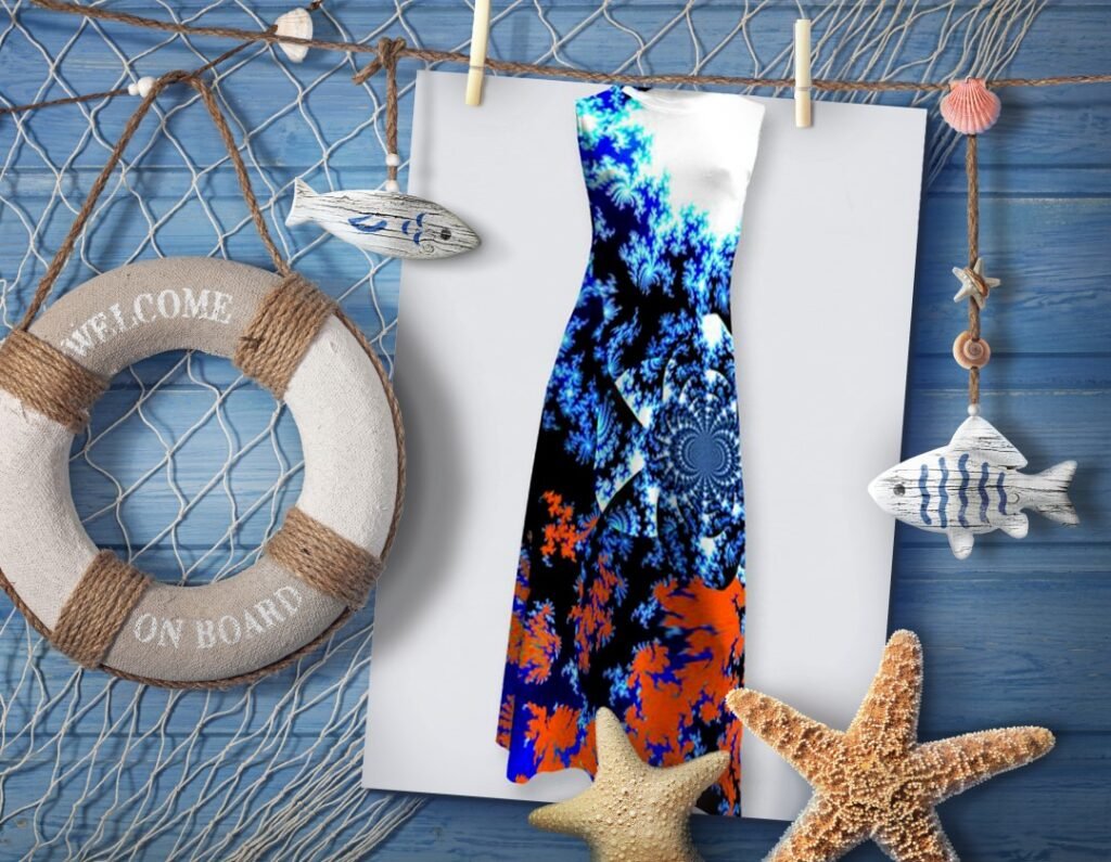
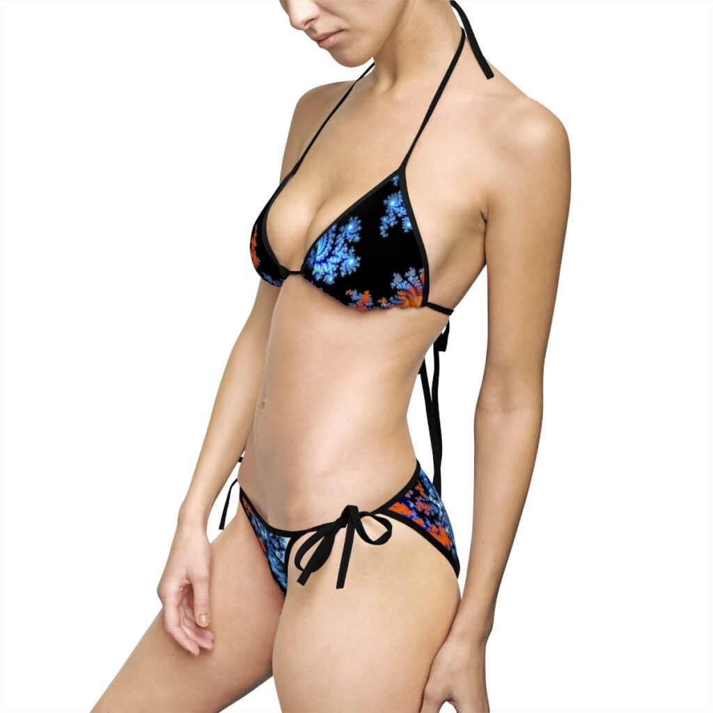
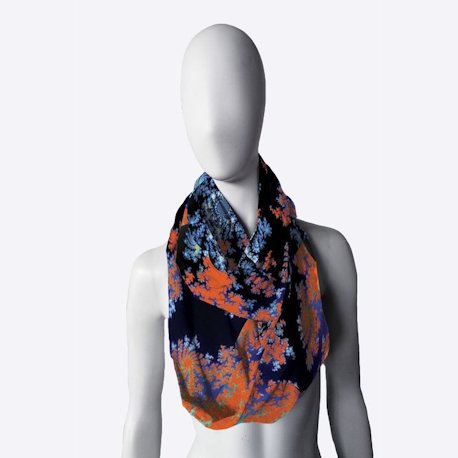
Abstract prints differ from traditional patterns through their artistic freedom. Where florals depict recognizable flowers and stripes follow predictable lines, abstract prints embrace spontaneity, geometric experimentation, and unexpected color combinations. They might feature gestural brushstrokes, fragmented shapes, bold color blocking, or complex layered compositions. These designs draw directly from art movements—Abstract Expressionism, Cubism, Color Field painting—bringing gallery-worthy aesthetics to everyday wear.
Designer Maria Miccoli of House of Miccoli has built her reputation on making such artistic designs accessible and wearable. Her work in everyday fashion, footwear, and home apparel demonstrates that abstract prints needn’t be relegated to special occasions or avant-garde fashion moments. Instead, they can enliven daily life, bringing color, energy, and artistic expression to ordinary routines. The key is knowing how to style them with confidence.
Two Essential Styling Approaches
When it comes to wearing abstract prints, there are two primary styling philosophies, each creating distinctly different effects. Miccoli’s design approach accommodates both, offering pieces that work beautifully in either context.
Approach One: Bold on Bold
The first approach embraces maximalism—pairing bold abstract prints with other vibrant patterns and saturated colors. This method requires confidence but delivers extraordinary impact. Rather than canceling each other out, carefully chosen bold pieces create dynamic visual conversations, with patterns and colors playing off one another to generate energy and excitement.
The Psychology of Bold Pairing: Wearing multiple bold patterns together signals creative confidence and refusal to conform to conventional fashion “rules.” It’s an inherently optimistic approach to dressing, celebrating abundance over restraint. When executed well, bold-on-bold styling doesn’t read as chaotic but as intentionally composed—a wearable collage that demonstrates sophisticated understanding of color, pattern, and proportion.
How to Execute Bold-on-Bold Successfully:
Find Color Connections: The secret to successful pattern mixing lies in color harmony. Look for pieces that share at least one or two colors, even if the patterns are wildly different. An abstract print featuring cobalt blue, coral, and gold can pair beautifully with another bold pattern incorporating any of these hues. The shared colors create visual thread that ties disparate patterns together, preventing the look from fragmenting into chaos.
Vary Pattern Scale: When combining multiple bold prints, varying the scale prevents visual competition. Pair a large-scale abstract print with smaller geometric patterns, or combine fluid, gestural abstracts with more structured tessellations. This variation creates hierarchy, allowing the eye to move comfortably through the composition rather than struggling to process competing information.
Balance Proportions: Consider how much of each pattern is visible. If wearing an abstract print dress, add patterned shoes or accessories rather than a patterned jacket. If your top features bold abstracts, pair it with patterned bottoms but keep outerwear solid. The goal is layered interest without overwhelming the eye.
Embrace Color Saturation: When going bold-on-bold, commit fully to saturation. Mixing vibrant abstract prints with half-hearted color choices dilutes the impact. If your abstract print features electric colors, pair it with equally confident hues. The cohesive energy level makes the look feel intentional rather than accidental.
Examples in Practice:
- Abstract print dress in blues, purples, and fuchsia paired with geometric patterned shoes incorporating similar jewel tones
- Bold printed pants featuring warm abstract shapes matched with a different but color-coordinated printed top
- Abstract print footwear combined with patterned socks or tights that share key colors
- Layering printed scarves or accessories over abstract print garments when colors harmonize
Approach Two: Bold Against Neutral
The second approach provides grounding for abstract prints by pairing them with subdued, neutral single-color pieces. This method allows the abstract print to become the undisputed focal point, creating sophisticated looks that balance artistic expression with wearable elegance.
The Psychology of Neutral Pairing: This approach communicates curated taste and intentional styling. It says, “I appreciate art enough to let it speak without competition.” The restraint of neutrals creates negative space that makes bold prints feel more luxurious and deliberate. This styling philosophy works particularly well in professional settings or for those building confidence with abstract prints.
Choosing Your Neutrals: Not all neutrals are created equal, and the best choice depends on your print’s color palette and the mood you’re creating.
Black: The most dramatic neutral, black creates maximum contrast with abstract prints. It makes colors appear more saturated and patterns more defined. Black works particularly well with prints featuring bright, clear colors or geometric abstractions. The combination feels modern, urban, and confident.
White and Cream: These light neutrals create breathing room around abstract prints, letting them glow without overwhelming. White feels fresh and contemporary, while cream offers softer, more approachable warmth. Both work beautifully with prints featuring softer color palettes or watercolor-like effects.
Gray: From charcoal to dove, gray provides sophisticated neutrality without black’s starkness. It’s particularly flattering with prints featuring cool tones and works well in professional settings where black might feel too severe.
Beige and Camel: These warm neutrals create elegant, accessible pairings with abstract prints. They feel less stark than black or white while still providing clean background for patterns to shine. Particularly effective with prints featuring earth tones or warm color families.
Navy: While technically a color, navy functions as a neutral in styling. It offers slightly more interest than black while maintaining similar grounding properties. Navy pairs exceptionally well with abstract prints featuring blues, teals, or cool tones.
How to Execute Neutral Pairing Successfully:
Single Color Coordination: Choose one neutral color and commit to it fully in your supporting pieces. If pairing an abstract print dress with neutral accessories, use the same neutral shade throughout—all black, all beige, all gray. This monochromatic approach to neutrals creates cleaner lines and more polished looks.
Consider Texture: When working with neutrals, texture becomes more important. A neutral knit cardigan offers different visual interest than a smooth leather jacket, even in the same color. Playing with texture in your neutral pieces prevents the look from feeling flat while keeping the abstract print as focal point.
Strategic Layering: Use neutral pieces to frame your abstract print. A neutral blazer over an abstract print top, neutral pants beneath an abstract print tunic, or neutral outerwear over an abstract print dress creates polished structure while letting the print shine.
Accessorize Thoughtfully: When pairing prints with neutrals, accessories can lean either direction. Neutral accessories (shoes, bags, jewelry in metals or stones) maintain cohesive simplicity. Alternatively, accessories that pull one accent color from the print can create color echo without pattern competition—for instance, coral shoes with a multi-color abstract print featuring coral among other hues.
Examples in Practice:
- Abstract print blouse tucked into black trousers with black shoes and simple metallic jewelry
- Abstract print dress worn with beige cardigan, beige shoes, and neutral tote
- Bold printed footwear as statement piece with all-black or all-white outfit
- Abstract print scarf as accent with entirely neutral ensemble
- Neutral jeans and solid tee letting abstract print jacket become the focus
Building Your Abstract Print Wardrobe
Start with Statement Pieces: Begin with one or two key abstract print items that genuinely excite you. These might be a dress, a pair of shoes, a blazer, or a statement top. Choose prints whose colors you love and that complement your existing wardrobe palette. Quality matters here—well-designed abstract prints maintain their impact through repeated wear, while poorly executed ones may quickly feel dated.
Consider Versatility: Your first abstract print pieces should work with multiple styling approaches. Look for prints that contain colors you frequently wear, making both bold pairings and neutral combinations possible. Miccoli’s designs often feature this flexibility, with bold artistic vision that nonetheless coordinates with various styling preferences.
Mix Scales and Styles: As you build your collection, vary the types of abstract prints you choose. Include some with larger, gestural marks and others with smaller, more intricate patterns. Collect pieces featuring different color palettes—cool-toned abstracts, warm-toned pieces, and perhaps some that bridge both families. This variety allows for more sophisticated pattern mixing and prevents your abstract print pieces from feeling repetitive.
Don’t Forget Home: Abstract prints need not be confined to fashion. Extending the aesthetic into home apparel and décor creates cohesive personal style that flows through all aspects of life. Throw pillows, blankets, or textiles featuring complementary abstract designs can echo your fashion choices, creating unified visual identity across your entire environment.
Confidence Is the Ultimate Accessory
The most important element in wearing abstract prints successfully is confidence. These bold designs demand ownership—you must wear them, not let them wear you. This confidence comes partly from understanding the technical aspects of styling (color coordination, pattern mixing, proportion) but ultimately from trusting your own aesthetic instincts.
If a bold-on-bold combination makes you feel electric and alive, wear it without hesitation. If you feel most sophisticated in abstract prints grounded by neutrals, embrace that approach fully. The “rules” matter less than finding what makes you feel authentically expressive and comfortable.
Practical Styling Scenarios
Professional Settings: Abstract prints absolutely work for work, particularly when paired with neutral pieces. An abstract print blouse with navy pants and blazer, or abstract print accessories with a solid-color suit demonstrates personality within professional contexts. Choose prints with somewhat structured compositions rather than extremely chaotic designs for more conservative workplaces.
Casual Everyday: This is where bold-on-bold pairings shine. Weekend errands, coffee dates, or casual social gatherings offer perfect opportunities to experiment with mixing patterns and playing with color. The relaxed context gives you freedom to take risks and develop your pattern-mixing skills.
Evening Events: Abstract prints make exceptional evening statements. A dramatic abstract print dress needs little embellishment—let the print be the jewelry. Alternatively, solid evening wear in luxe fabrics paired with bold abstract print accessories creates sophisticated contrast.
Transitional Weather: Layering season offers excellent abstract print opportunities. An abstract print dress becomes four-season versatile when layered with neutral cardigans, jackets, or blazers. Abstract print footwear adds interest to layered neutral outfits during shoulder seasons.
Color Psychology and Print Selection
Different abstract prints create different emotional effects, partly through their color palettes. When selecting prints to wear, consider the energy you want to project:
Warm abstracts (reds, oranges, yellows) radiate energy, optimism, and approachability. They’re attention-grabbing and confidence-boosting, perfect when you want to make strong impressions or need energy.
Cool abstracts (blues, greens, purples) feel calmer, more contemplative, and sophisticated. They attract attention more subtly, working well in situations requiring authority or thoughtfulness.
High contrast abstracts (strong darks and lights) create drama and make bold statements. They photograph beautifully and create maximum impact.
Tonal abstracts (variations of related colors) feel more sophisticated and easier to style. They offer artistic interest without overwhelming, often working better for those new to wearing bold prints.
Maintaining Your Abstract Print Pieces
Artistic prints deserve careful maintenance to preserve their impact. Follow care instructions precisely, as colors and patterns can fade with improper washing. Store hanging items on padded hangers to maintain shape. For special pieces, consider professional cleaning. Quality abstract print items, well cared for, remain wardrobe staples for years.
Permission to Experiment
Fashion, at its best, is playful experimentation. Abstract prints invite this play—they’re inherently unconventional, so conventional styling rules bend around them. Try combinations that intrigue you. Mix patterns you wouldn’t think go together. Pair that bold print with either matching vibrancy or grounding neutrals, depending on your mood and occasion.
Maria Miccoli’s work at House of Miccoli demonstrates that abstract prints belong in everyday life, not relegated to artistic performances or fashion-forward occasions alone. These designs can be as practical as they are beautiful, as wearable as they are expressive. Whether you pair them with equally bold companions or let them sing against neutral backgrounds, abstract prints offer daily opportunities to wear art, express creativity, and move through the world wrapped in color and imagination.
The key is to start, experiment, and trust your instincts. Your personal style emerges through trial, discovery, and the confidence to wear what makes you feel authentically yourself—whether that’s bold on bold, print against neutral, or your own innovative hybrid approach. Abstract prints reward this confidence with versatility, impact, and the daily pleasure of wearing something truly artistic.


More Stories
Fractal Lemonade Blues
The Perfect Weekend Bag
Lifestyle Geometry